Hi,
Today, I come back here to share a new project I have made these last days : Z-GRID
This is a extremly lightweight CSS grid system allowing you to quickly start a project by integrating a css responsive grid.
It is composed of a RESET part of CSS so you should place it before your own css stylesheet and the grid system.
You will be able to create a grid by specifying how many columns you want. This grid will be displayed normally on a computer screen and each box will be on a line on a mobile screen. It is possible to force the grid to display as you write it on mile screens.
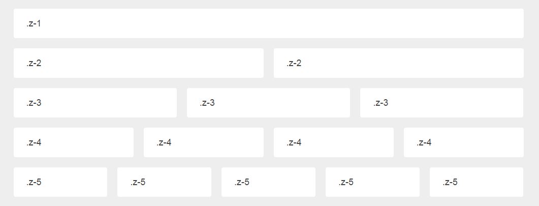
Example
Grid with 2 boxes
<div class="z-grid">
   <div class="z-2">

      <div class="z-box">
         <p>box-1</p>
      </div>

      <div class="z-box">
         <p>box-2</p>
      </div>

   </div>
</div>
(if you use emmet, you will be able to type this code very fast!)
Here, there will be a grid with 2 boxes per lines.
- On computer screen (>768px) : both are on one line.
- On smartphone screen (< 768px) : each box is on a different line.
More information
Everything is explained HERE
This project is intended to evolve, but it is fully functionnal today.
Share, fork, pull request it if you like my work :)